One of my first jobs was a summer internship with a technical analyst. In those days, charting was considered by many to be akin to voodoo. The practitioners pored over their graphs, many of which were hand-drawn, trying to discern patterns that could guide one’s trading and/or investing behavior. We can engage in a long debate about the pros and cons of charting and technical analysis, but my experience as an intern helped shape the views that I honed as a long-time trader: technical analysis is hardly a panacea, but investors who ignore basic lessons about trends, momentum, support, and resistance are missing important long and short-term timing tools.
While doing my usual rounds of key charts, I noticed that arguably the most important commodity seems to be forming an important technical pattern – a double bottom. Below is a two-year chart of rolling front month crude oil futures (CL):
CL Futures, 2-year Daily Candles (red/green, top), 30-day Moving Average (blue, top), MACD (12,26,9, bottom)
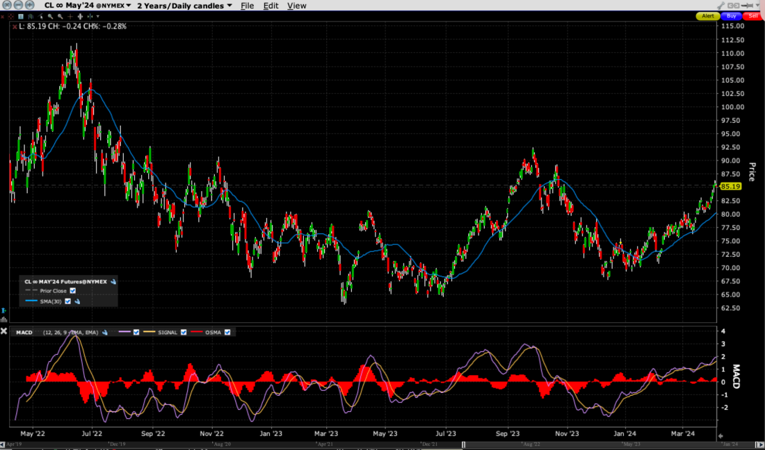
Source: Interactive Brokers
To my eye, the recent bounce in crude oil prices appears to be a potential double bottom. As with so many financial products, prices have recently been rising in a well-defined trend, but the longer-term view shows that oil found support around the $70 level and has since turned higher. The short-term target appears to be the $90 resistance area, but the longer-term pattern suggests that a break above that level is possible. And while that would be good for those who hold energy stocks, it would be bad for most everyone else.
We’ve all had it drummed into our minds that the Federal Reserve’s preferred measure of inflation is the PCE Core Deflator. Core inflation measures exclude volatile food and energy components, which by definition mean that oil’s rise should have little to no impact. But here’s the problem: the Fed is also concerned about managing inflationary expectations, and energy prices are a key determinant. The following chart shows the relationship between University of Michigan 1-Year Inflation Expectations and AAA National Unleaded Gasoline Prices:
University of Michigan 1-Year Inflation Expectations (yellow) vs. AAA National Unleaded Gasoline Prices (green) Since December 2016
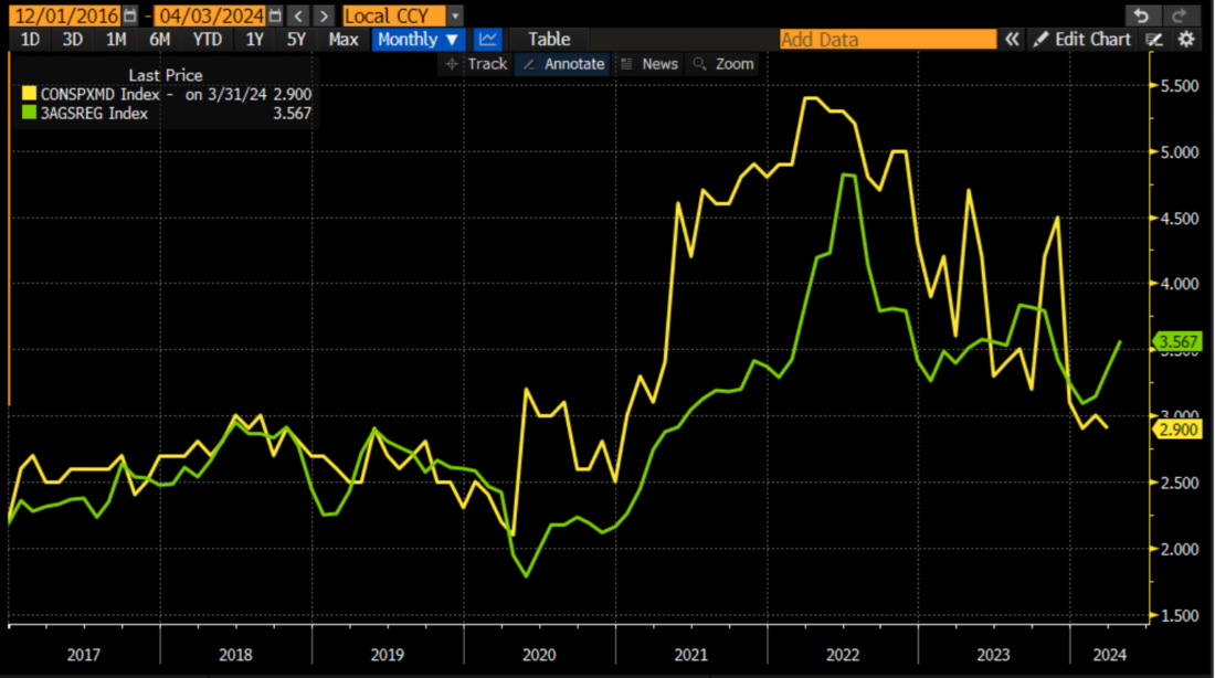
Source: Bloomberg
There is clearly not a perfect relationship between pump prices and inflationary expectations, but they certainly move in the same general direction. Lately it appears that inflationary expectations lag gasoline prices by about one- to two-months. If we are indeed seeing sustainably higher energy prices, then inflationary expectations are likely to follow. And that would complicate the Fed’s fight against inflation.
In the short term, if the chart pattern is to be believed – and if you believe that we are more likely to see a sustained advance in oil prices rather than a short-term trend that is closer to its natural end – then gaining exposure to the sector would make sense. Those with a high risk tolerance can trade energy futures and options directly, while many investor might favor equity-related methods, such as energy stocks and/or ETFs. The following graph shows the recent relationship between XLE, a popular energy sector ETF, and USO, a publicly traded limited partnership that holds oil futures:
6-Month Chart, XLE (red/green candles) vs. USO (blue line)
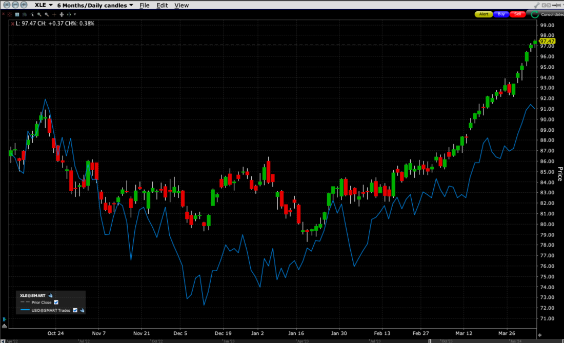
Source: Interactive Brokers
Thanks to the ebullient stock market, we see that energy stocks have generally outperformed the underlying commodity recently. That is a standard feature of any sector that is closely linked to a commodity. The commodity strongly influences the stocks, but the tone of the equity market influences whether the stocks outperform or underperform.
Besides my early lessons about how price charts reflect supply and demand for the stock or commodity in question, another early lesson comes to mind: become concerned if oil stocks lead the market because it indicates that inflationary pressures are taking root. Considering how we’re all so focused on technology stocks (guilty), it was easy to overlook that energy stocks have indeed begun to outpace the broad market as a whole. Pay close attention to how the S&P 500 (SPX) has moved up at a much slower pace than XLE:
3-Months XLE (red/green candles) vs. SPX (blue line)
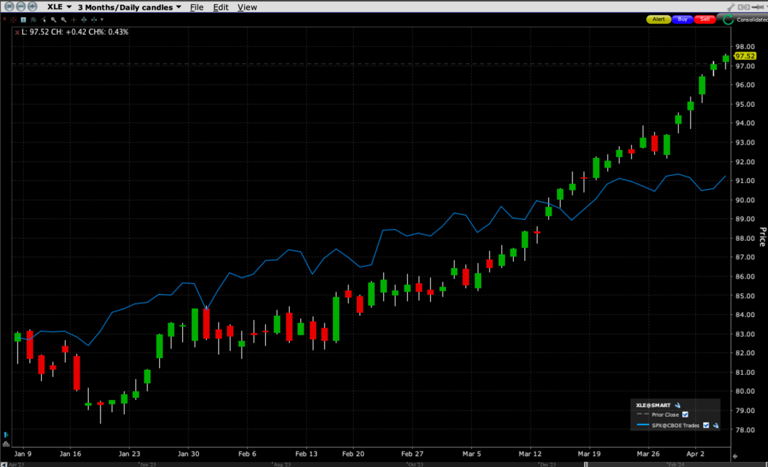
Source: Interactive Brokers
Does this one chart mean that investors should start heading for the exits? No. A key tenet of technical analysis is not to put too much faith in one single chart or indicator. But it is one more data point that could spur investors to consider more defensive strategies. We outlined several of them earlier this week.
One should always respect the messages that the market is sending, and technical analysis offers one way to do that.
Related Tags:
Disclosure: Interactive Brokers
The analysis in this material is provided for information only and is not and should not be construed as an offer to sell or the solicitation of an offer to buy any security. To the extent that this material discusses general market activity, industry or sector trends or other broad-based economic or political conditions, it should not be construed as research or investment advice. To the extent that it includes references to specific securities, commodities, currencies, or other instruments, those references do not constitute a recommendation by IBKR to buy, sell or hold such investments. This material does not and is not intended to take into account the particular financial conditions, investment objectives or requirements of individual customers. Before acting on this material, you should consider whether it is suitable for your particular circumstances and, as necessary, seek professional advice.
The views and opinions expressed herein are those of the author and do not necessarily reflect the views of Interactive Brokers, its affiliates, or its employees.
